Challenging Climate Narratives: Investigating Michael Mann's 'Hockey Stick' Graph and Data Adjustments
Challenging the narratives woven by climatologist Michael Mann's 'Hockey Stick' graph, this article delves into the complexities and contentions surrounding historical climate data reconstruction.


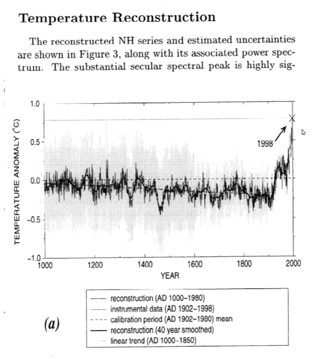
The "hockey stick" graph, popularized by climatologist Michael Mann, illustrates a reconstruction of past temperatures, showing a relatively stable climate for 900 years before a sharp increase in the 20th century. The graph has been a point of contention, with some questioning the accuracy of the temperature reconstructions and the implications for our understanding of climate change.
The Hockey Stick Graph
The graph depicts a long period of stable temperatures, resembling the shaft of a hockey stick, followed by a rapid rise in the 20th century, forming the blade. The temperature spike coincides with the industrial era, suggesting a link between human activity and global warming. This interpretation has been influential in the political discourse around climate change.
Temperature Data and Glacial Retreat
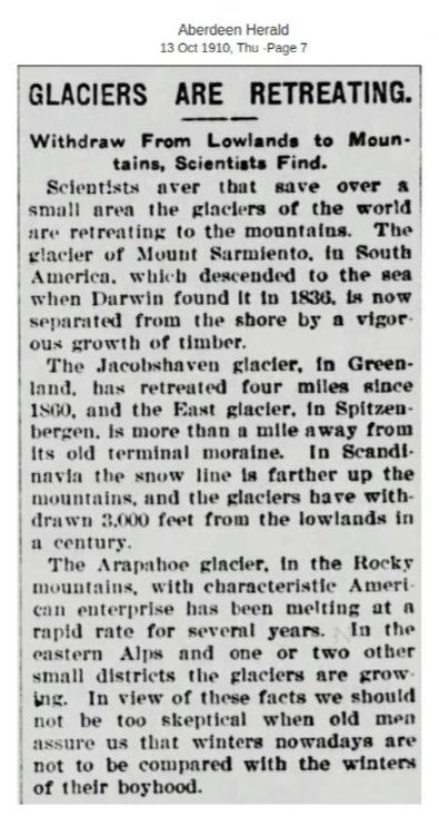
During the second half of the 19th century, a period that Mann's graph suggests was cold, there is empirical evidence of widespread glacial retreat. This phenomenon typically occurs in warmer conditions, raising questions about the temperature reconstruction's accuracy during this period. The inconsistency between the graph and the glacial record suggests that the historical temperature data may not fully reflect climate dynamics.
Global Temperature Record and Data Scarcity
In analyzing the temperature record for the year 1910, a lack of thermometer data from large regions of the world, including Africa, the Middle East, Asia, and parts of South and Central America, is evident. This scarcity of data challenges the construction of comprehensive global temperature maps for the early 20th century.
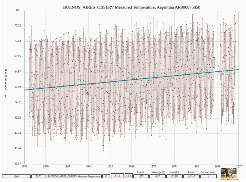
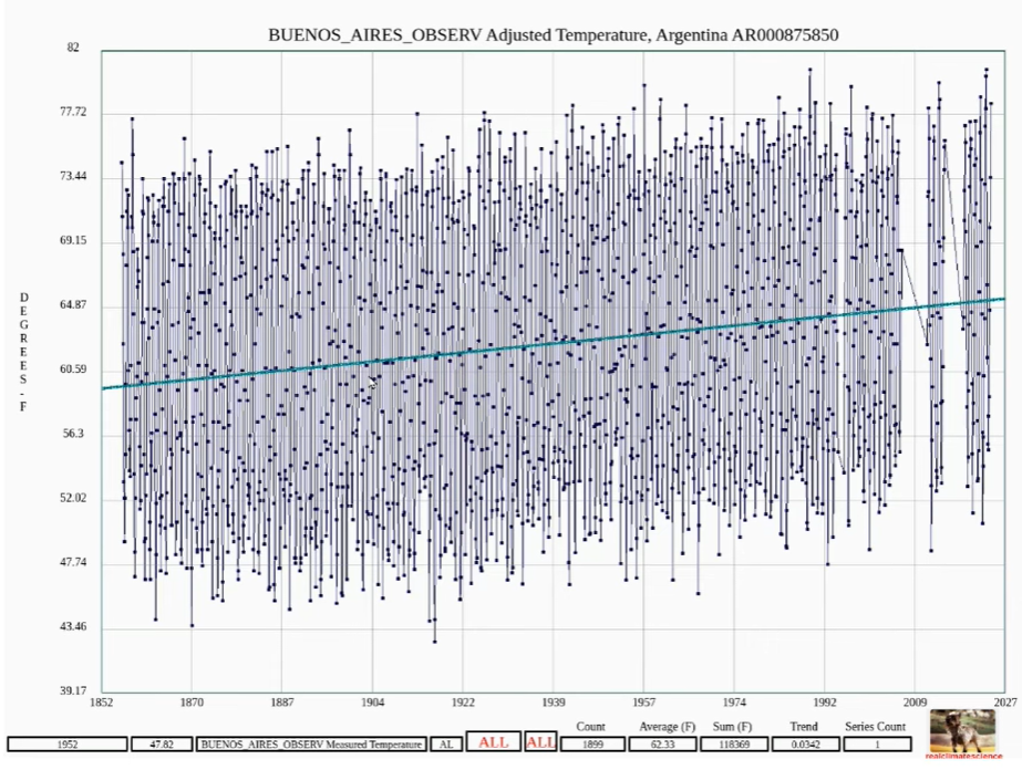
Temperature Data Adjustments
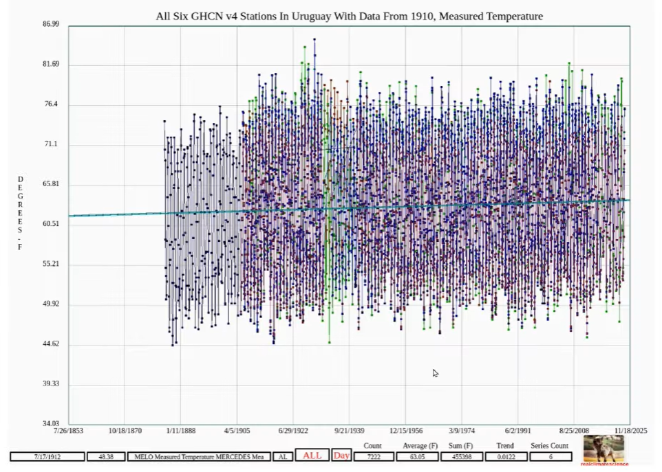
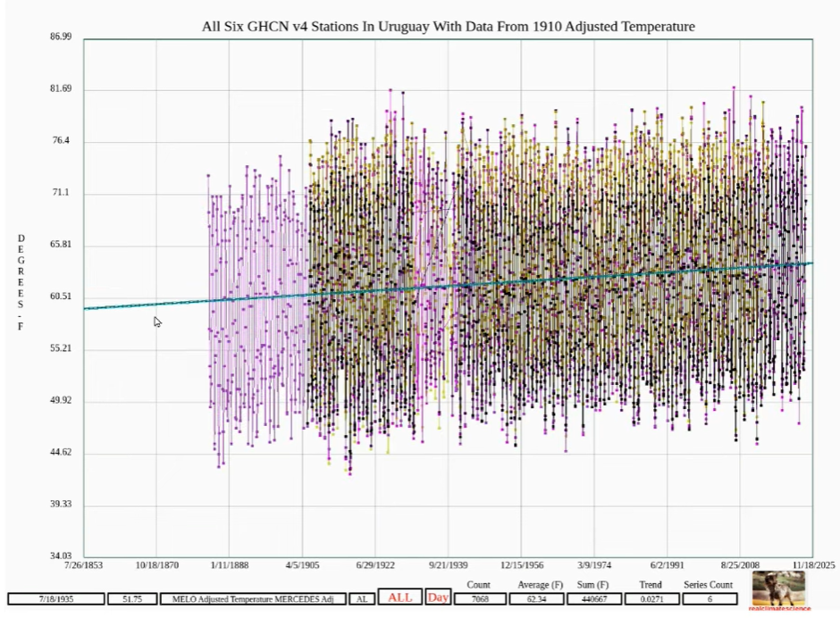
Focusing on Uruguay and Buenos Aires, Argentina, temperature data shows an upwards trend since 1880. However, after adjustments by the National Oceanic and Atmospheric Administration (NOAA), the trend appears stronger. Critics argue that NOAA's methodology, which incorporates data from urban areas like Buenos Aires known for the urban heat island (UHI) effect, may skew the temperature record.
Buenos Aires Temperature Data Controversy
The UHI effect, which can artificially raise temperatures in densely populated urban areas, should, in theory, be mitigated in the final temperature record. However, comparisons between the measured and adjusted temperatures at Buenos Aires reveal a slight increase in the temperature trend post-adjustment, contradicting claims of mitigation.
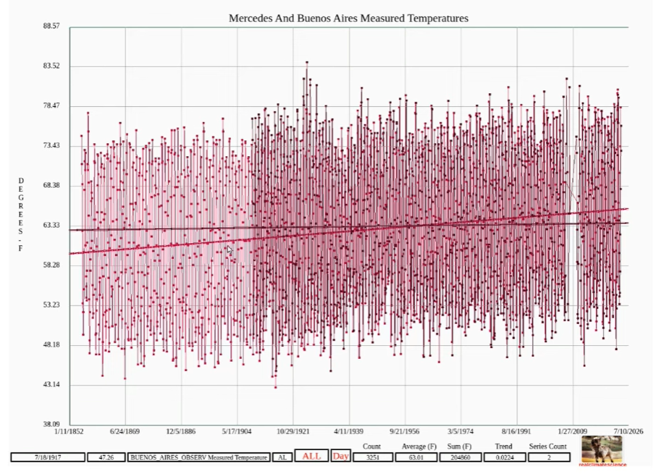
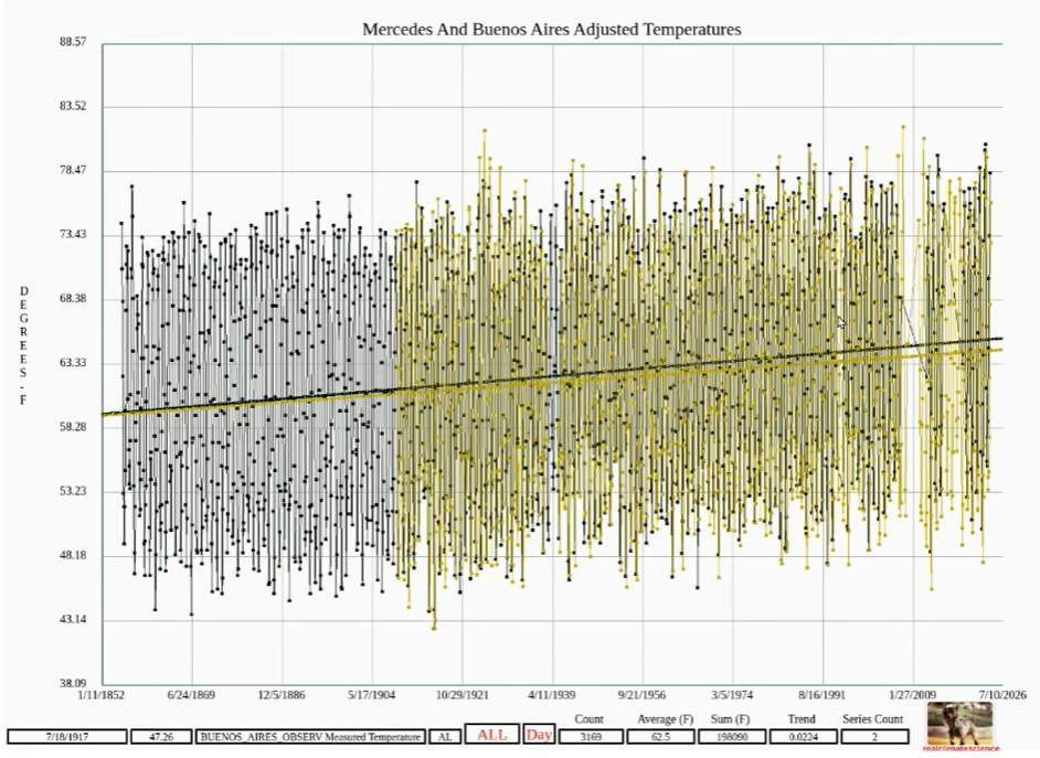
Impact on Nearby Stations
A comparison of temperature trends at Buenos Aires and Mercedes, Uruguay, shows differing warming patterns, with Mercedes exhibiting little to no warming. Post-adjustment, the trends at both stations align more closely, suggesting that data from Buenos Aires may influence the temperature record at Mercedes, despite the potential UHI contamination.
Conclusion
The debate around the "hockey stick" graph and temperature data adjustments highlights the complexities of reconstructing historical temperatures and the impact of data manipulation on our understanding of climate change. Questions about the legitimacy of adjustments that incorporate potentially contaminated data from urban heat islands underscore the current lack of transparency in climate science.