

More and more news reports come out concerning the booming economy- but underneath the surface, things are not as they seem. Can we even trust the veracity of the data anymore?
In the last few months, I’ve started to realize that there have been several strange anomalies that have popped up with the government’s employment numbers. For years, we have grown accustomed to issues with the CPI, due to the constant moving of goalposts undertaken by the Bureau of Labor Statistics, the agency. But now, it appears that the jobs are being manipulated as well, to portray the facade of a strong and booming economy, when the story is more complex beneath the surface.
I first noticed this issue last year when the New York Post discovered that a massive 439,000 jobs were quietly removed from last year’s data up to November 2023.
In August 2023, the Bureau of Labor Statistics had released an initial revision covering the 12 months leading up to March 2023, revealing that U.S. job growth during that time was overstated by a net of 306,000 jobs. This translates to an average of 25,500 fewer jobs per month during that period.
Another interesting thing to note with the data- jobs are increasingly disappearing from the private sector, and the areas of biggest growth are coming from federal spending. In that same period, adjustments were made to private sector job creation, which was lowered by 358,000 jobs, while government payrolls saw an increase of 52,000 jobs. Last September saw over half of all job growth tied to government agencies.
Even more shocking, their own models doubt the veracity of the numbers. In December 2022, the employment algos of the Philadelphia Federal Reserve Bank suggested that the BLS had overestimated job growth by 1.1 million in the second quarter of that year.
In general, government statistics have always been slightly misleading, stretching the truth or softening an inconvenient downside miss. However, in the past few years, things have gotten substantially worse. Economists are now reporting stellar numbers, beating expectations handily each month, only to revise the figures down months later after the press has moved on to other more current topics.
Marketwatch points out:
“The official U.S. employment reports chronically overstated how many jobs were created each month in 2023, potentially misleading Wall Street, the Federal Reserve and Washington lawmakers about the true strength of the economy.
From January to October, the government initially overestimated job growth in nine of the 10 months. Eventually the employment gains were reduced by an average of 55,000 a month, an unusually large change.
Take last June as an extreme example. The government initially said a robust 209,000 new jobs were created before marking its final estimate down to a tepid 105,000 two months later.”
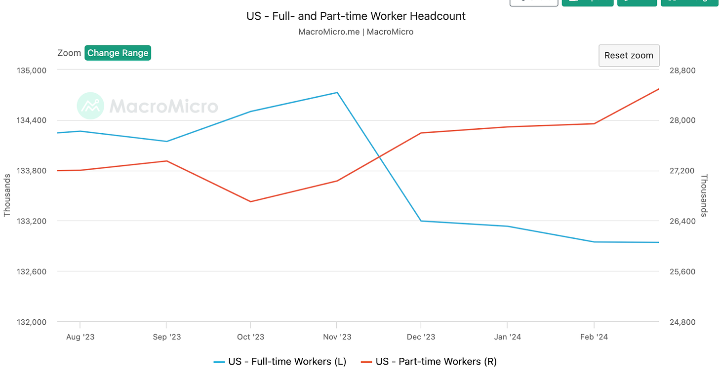
A further point is the actual composition of job creation. Although even the revised numbers appear to be strong, the jobs being created are not. The 2023 household employment survey showed a decrease in the overall number of employed individuals. But, the number of part-time workers increased significantly, rising by 762,000. In contrast, the number of people in full-time employment dropped by 1.6 million, marking the most severe decline in full-time jobs since the Covid recession.
I should mention there is a categorical difference between the two surveys. The headline number typically reported by news outlets is from the "establishment survey," which represents the total number of payroll positions rather than the total number of employed individuals. The household survey basically involves interviewing individuals about their employment status. Due to some individuals holding multiple jobs, the total number of jobs can rise even if the number of employed people decreases.
The payroll numbers released by the BLS also show a similar story. Overall, there appears to be job growth on the surface, but when we look under the hood, part time workers are increasing, while full-time employment keeps falling. We are slowly becoming a gig economy- software engineers, lawyers, and product managers are being laid off and being replaced with Uber drivers and retail store associates. This isn’t indicative of a healthy and thriving market.
Another report from the Labor Department, released in January, revealed an unexpected slowdown in job openings, with the number falling to 8.7 million by the end of November. This is the lowest since March 2021, showing a decrease from the downwardly revised figure of 9.3 million openings reported the previous month.
Although this dip caught economists off guard, it aligns with recent data from the employment website Indeed. As of December 29, open positions on the site had decreased by more than 15% compared to a year earlier.
And that doesn’t even account for the layoffs.
Another way that the stats are manipulated is through the Unemployment Rate. Currently, it sits at 3.8%, which is pretty low for historical standards. It dropped below 4% in January 2022 and hasn’t gone above it since. Prior to the pandemic, unemployment was in this range as well. So on the surface, it appears that the job market has fully recovered, right?
The real story is more complex. Unemployment is calculated as # of people looking for work actively divided by the people available to work (workforce). The government can change the denominator by artificially removing people from the workforce, and claiming therefore that unemployment is falling since the overall labor pool has lessened.
Daniel R. Amerman, CFA has laid this out beautifully in a post over a decade ago concerning this exact issue. I recommend you go read the whole thing (it is long), but I will quote the first paragraphs of his piece here:
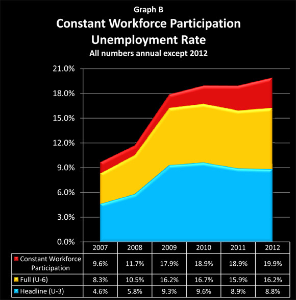
When we look at broad measures of jobs and population, then the beginning of 2012 was one of the worst months in US history, with a total of 2.3 million people losing jobs or leaving the workforce in a single month. Yet, the official unemployment rate showed a decline from 8.5% to 8.3% in January - and was such cheering news that it set off a stock rally.
How can there be such a stark contrast between the cheerful surface and an underlying reality that is getting worse?
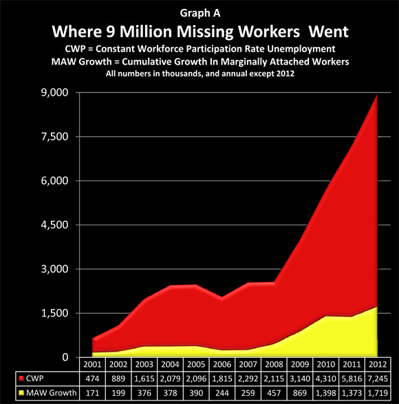
The true unemployment picture is hidden by essentially splitting jobless Americans up and putting them inside one of three different "boxes": the official unemployment box, the full unemployment box, and the most obscure box, the workforce participation rate box.
As we will explore herein, a detailed look at the government's own database shows that about 9 million people without jobs have been removed from the labor force simply by the government defining them as not being in the labor force anymore. Indeed - effectively all of the decreases in unemployment rate percentages since 2009 have come not from new jobs, but through reducing the workforce participation rate so that millions of jobless people are removed from the labor force by definition.
As workforce participation falls, the unemployment rate falls, all else equal, since you divide the same number of unemployed people by a smaller base. This makes the numbers look stellar!
The U.S. Bureau of Labor Statistics actually measures unemployment in six different ways (talk about confusing!), from U-1 to U-6, with the U-6 statistic aggregating all categories of unemployment.
SPONSOR: I’ve talked a lot about the value of Bitcoin and its use case as fiat currencies inflate away. As such, I'm proud to have Onramp as a sponsor supporting this newsletter, a firm at the forefront of pioneering a trust-minimized form of Bitcoin custody. With Onramp Multi-Institution Custody, assets live in a multi-sig vault controlled by three distinct entities, none of which have unilateral control.

To learn more about Onramp's products for individuals and institutions, connect with their team or schedule a consultation.
Now let’s get back to it!
There’s a large difference between the U-3 official unemployment rate and the U-6 comprehensive unemployment rate, particularly in how they account for long-term unemployed individuals and those involuntarily working part-time. If you've been jobless for an extended period, actively sought work without success, and haven't recently applied for a job because you've already applied everywhere possible, the official U-3 measure no longer counts you as unemployed. You don’t exist anymore.
The government reduces overall workforce participation by claiming that millions of 20, 30 and 40 year olds are no longer looking for work, and all hope is lost for them to ever find a job. They even mention this on the BLS’ own website.
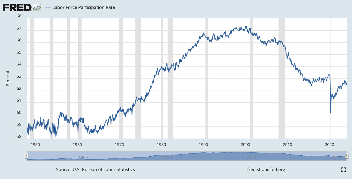
We can see this clearly in the falling workforce participation rate. The current figure of 62.7% is truly abysmal, and you have to go back to December 1977 (almost 50 years!) to find a similar number. Overall, we peaked in the late 90s and early 2000s, and the number has been steadily declining ever since. It’s also key to note that the rate is currently below where it was at pre-COVID, which is not something you would grasp if you were just looking at headline unemployment rate (U2).
Now, you might retort that this is due to the wave of baby boomers retiring, where 10,000 seniors are retiring every day, removing 3.6M people from the workforce every year. That does sound plausible, until you look where the workforce is shrinking (or what the BLS claims where it is shrinking).
Again, Daniel points this out in a graph from 2012:
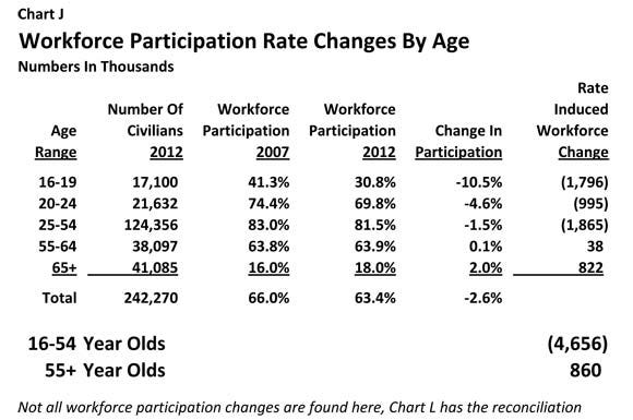
If demographic shifts due to an aging population were influencing changes in labor force participation rates, one would expect stable participation among those under 50, with declines occurring among individuals in their 50s, 60s, and older. However, this is not the case as participation for 65+ individuals actually rose!
The largest percentage decrease in workforce participation has been among 16 to 19-year-olds- they are now the group most often categorized as "out of the workforce" by governmental definitions. By this definition, 1.8 million teens dropped out of the workforce in just a few years.
Interesting right!
Jim Bianco pointed out on Twitter another incredible anomaly:
Below is the number of initial filings for unemployment insurance.
How is this statistically possible?
Five of the last six weeks, the exact same number.
Effectively the same number in the last 11 weeks, except for the holiday weeks (President's Day and Easter).
Consider
The US is a $28 trillion economy. It has 160 million workers.
Initial claims for unemployment insurance are state programs, with 50 state rules, hundreds of offices, and 50 websites to file. Weather, seasonality, holidays, and economic vibrations drive the number of people filing claims from week to week.
Yet this measure is so stable that it does not vary by even 1,000 applications a week.
Just the number of applications incorrectly filled out every week should cause it to vary more than this.
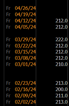
Statistically, an occurrence such as this is basically impossible- for initial filings to be the same exact figure, not even deviating by a measly 1,000 in an economy as big as ours, would require mental gymnastics that not even Simone Biles could undertake.
We’ve known for years that CPI has also been misleading, and no wonder.
The government has a lot of tools to influence the CPI, one of which involves the Bureau of Labor Statistics keeping confidentiality over the raw data used to calculate the CPI. Their claimed explanation is “to prevent companies from comparing prices”. This makes zero sense as firms can just directly compare prices with competitors by looking up their website.
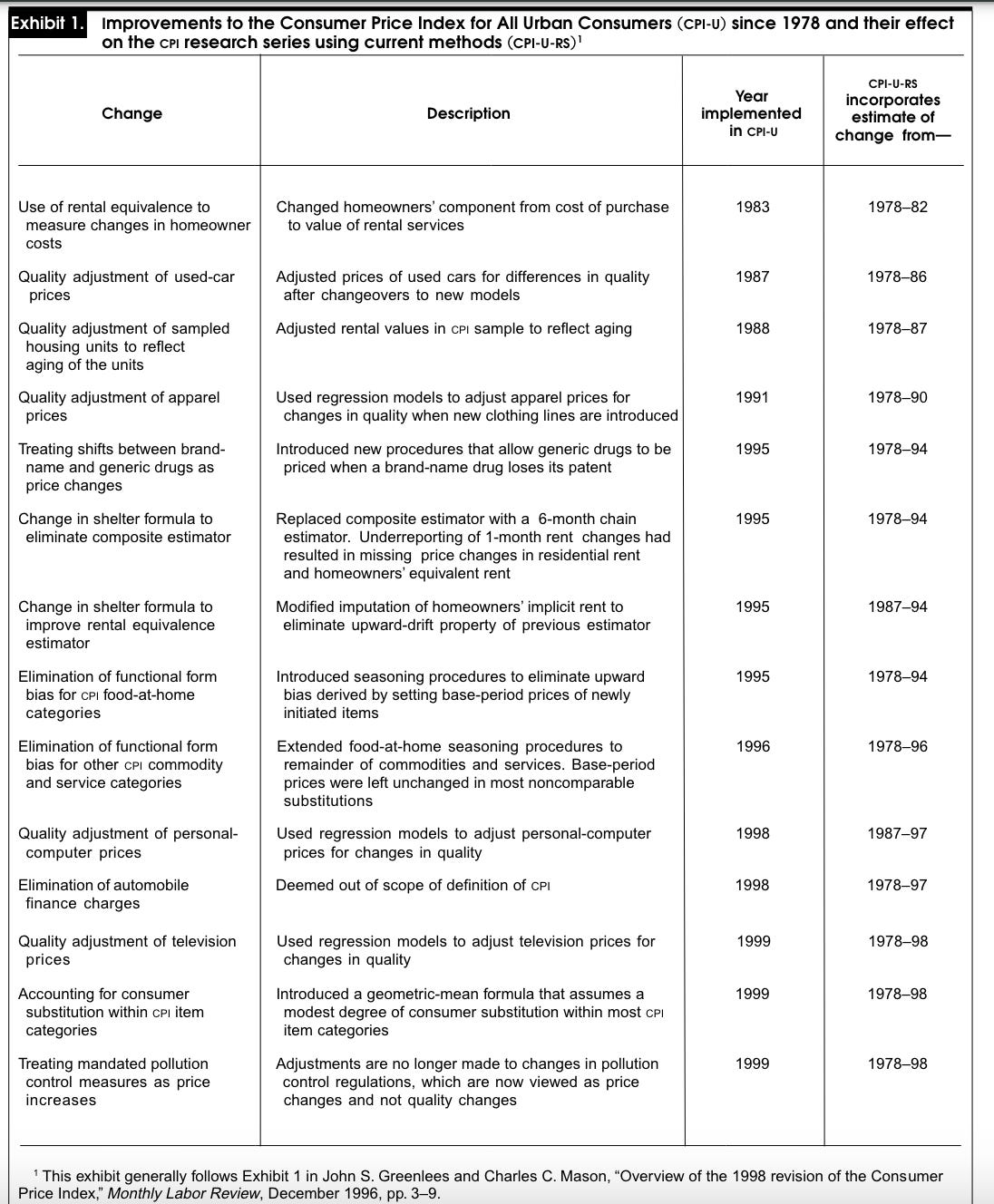
Moreover, during the last three decades, the government has changed the method it uses to calculate inflation over 20 times. These changes, called 'methodological improvements' to the Consumer Price Index (CPI), are claimed to provide a more precise reflection of consumer prices. This is hilarious, given that most consumer behavior changes slowly, with the only possible exception being adoption of tech products.
See their report for yourself here.
Also, the BLS assumes that consumer spending patterns shift in response to changing economic conditions, including price increases. So, if consumers start buying cheaper alternatives when prices go up, the CPI calculation will contain a bias that fails to fully capture these price increases. Basically, they can do things like substitute bacon and eggs for milk and cereal, which would drive down the price of a breakfast.
The CPI directly affects the income of approximately 80 million Americans, including Social Security beneficiaries, recipients of food stamps, military and federal civil service retirees and survivors, and children participating in school lunch programs. A higher CPI means the government must spend more on these income payments to match the rising cost of living. However, given that the government is approximately $34 trillion in debt, a lower headline CPI would reduce the amount needed for cost of living adjustments, helping to ease the fiscal crisis we are currently in.
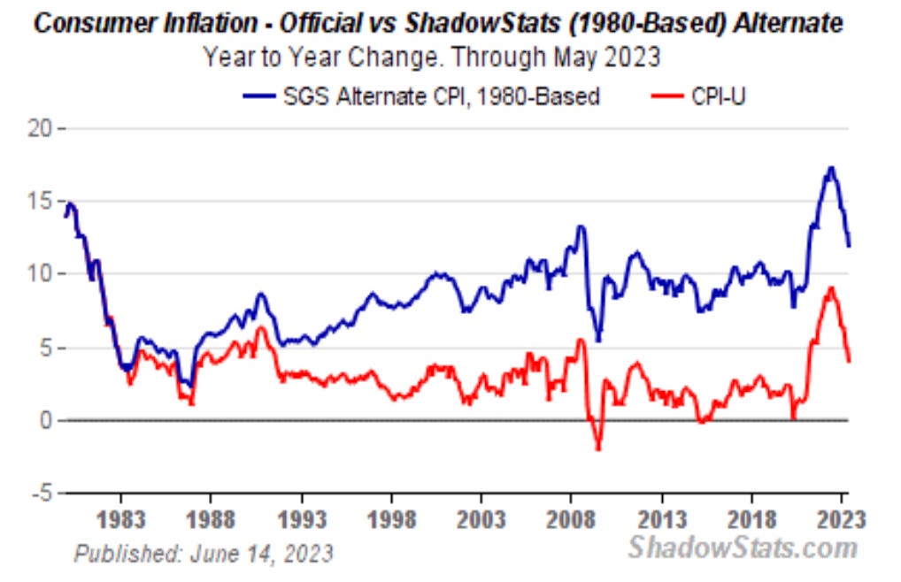
Shadowstats is a website that tracks inflation rate but it uses an older version of the basket to find more accurate figures- we can see here that with the 1980 CPI index we actually peaked at 17% inflation in 2022 and realized inflation was still above 10% in mid 2023.
As the fiscal crisis worsens, we can expect government manipulation to ramp up as well. Sadly, this is one of the signs of the Dollar Endgame- institutional lying, due to collapsing social trust in them and a desperate need to paper over real economic wounds.
The true extent of the problem cannot be hidden forever- and when this day comes, the mobs of unemployed will have no mercy for the sycophantic politicians or the bureaucrats which they serve.
Potemkin was a Russian officer and politician who was a favorite of Catherine II and in 1762 helped her to seize power; when she visited the Crimea in 1787 he gave the order for sham villages to be built to give off the illusion of prosperity. Is the modern economy any different?

Originally Published in The Dollar Endgame